This link is exclusively for students and staff members within this organisation.

Unauthorised use will lead to account termination.

Previous

East London

Next

Comparing maps and photographs

geographical skills

Exploring population pyramids

As a GCSE geographer you will be expected to understand and interpret population pyramids. You must be able to explain what they show about the demography of a country, compare population pyramids of different countries and link them to geographical theories

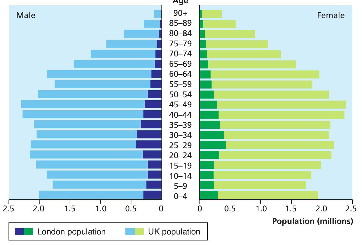
Figure 1 Population pyramid for London compared to UK (2011)

Go to  www.hoddereducation.co.uk/wideworldextras for homework on this topic.

Population pyramids are a type of graph used to show the population structure of a country. The graph plots the percentage of people in different age groups and divides it into female and male, as shown in Figure 1. Population pyramids are a type of a histogram as they show continuous data and when drawn the bars are touching.

Your organisation does not have access to this article.

Sign up today to give your students the edge they need to achieve their best grades with subject expertise

Subscribe

Previous

East London

Next

Comparing maps and photographs

Related articles: