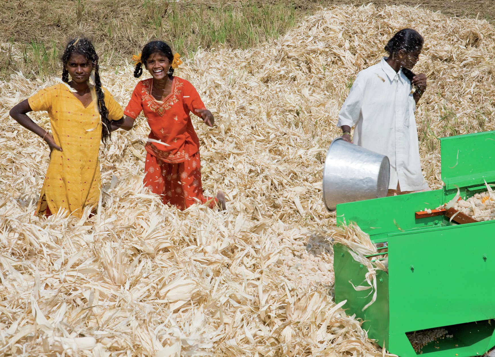
Log on to the CIA World Factbook at https://www.cia.gov/library/publications/the-world-factbook. You can obtain information about individual countries in a number of ways. Move your pointer over the world map to India. Select <South Asia> and then <India>. This shows you the flag and location maps, and allows you to view some photos. Scroll down the list of data headings below this and select <Economy>. This expands to provide a range of information. Find the heading ‘Labor force — by occupation’ (US spelling) and you can see the percentage employed in agriculture, industry and services.
Open a new spreadsheet (such as Excel), insert these categories and figures into separate cells and then create a pie-chart of this information. You can compare the figures with those of any other country by clicking the <Field listing> icon at the end of the heading row of ‘Labor force – by occupation’. This takes you to an alphabetical list of the same data for every other country in the world. Scroll down the list and find the UK. Add these data to your spreadsheet and create another pie chart.
Your organisation does not have access to this article.
Sign up today to give your students the edge they need to achieve their best grades with subject expertise
Subscribe


